What goes above the fold on a Shopify PDP in 2026
 By Dror Aharon
·
CEO, COREPPC
·
Updated April 17, 2026
·
11 min read
By Dror Aharon
·
CEO, COREPPC
·
Updated April 17, 2026
·
11 min read
Shopify PDP above fold is where most of the conversion decision happens, and most stores treat it like a layout slot instead of the only real estate that has to close the deal. On mobile, which is now 78 to 84% of PDP traffic, that means roughly 700 vertical pixels to carry a hero image, title, price, social proof line, buy box, and one trust signal. Six things, one screen, no room for drift. Stores that get it wrong plateau at 1.8 to 2.4% PDP conversion rate and blame traffic quality. Stores that ship the six elements below cleanly cluster at 3.5 to 4.8% on the same traffic, because the visitor never has to scroll to decide. The rest of the page is support. Above the fold is the page. Everything that follows is either reinforcing it or leaking revenue it already earned.
- Six elements are non-negotiable above the fold. Anything else is friction.
- Hero image is a use-context shot, not a studio shot. This alone moves 8 to 14%.
- Buy box architecture changes based on variant count. Single and multi need different layouts.
- Mobile above-the-fold is a different page than desktop. Treat it that way or lose 30%+ of the decision.
What above-the-fold actually means on a Shopify PDP in 2026
Above the fold on a Shopify PDP in 2026 is not the desktop 1440x900 frame most designers still mock up in Figma. It is a 390x700 mobile viewport, because that is what 80% of your traffic sees first, and 90% of your decisions happen there before a single scroll. The desktop above the fold is a secondary concern, not the primary one. Most stores build the PDP the other way around, ship the desktop layout first, then cram it onto mobile and hope the sticky add-to-cart saves them. It does not. The mobile above the fold is the page, full stop.
The shift that actually matters: on a 390x700 viewport, you have room for maybe six elements before the user has to scroll. Hero image, title, price, one social proof line, variant selector, and the buy box. That is it. Every theme ships with slots for more (breadcrumbs, category tags, collection links, wishlist buttons, share icons, sometimes a full review block). Each of those costs you 50 to 100 pixels of the only real estate that matters. Best to strip the PDP back to the six, then add things back one at a time only if they earn their place by moving a measurable metric.
The "fold" itself is also softer in 2026 than it used to be. Scroll is cheap, tap is expensive. Shoppers will scroll once if the hero convinced them to, but will not tap into a nested menu to find information that should have been visible. So "above the fold" really means "reachable without a tap and without a second scroll." That is a useful working definition, because it stops designers from hiding the return policy behind an accordion or the price comparison inside a tooltip. If it matters, it has to be readable in the first 700 pixels without any interaction. Google's Cumulative Layout Shift guidance is the other reason this matters: elements that load late and push the fold around cost you both CR and Core Web Vitals score, which cascades into paid quality score too.
The 6 elements that should live above the fold (non-negotiable)
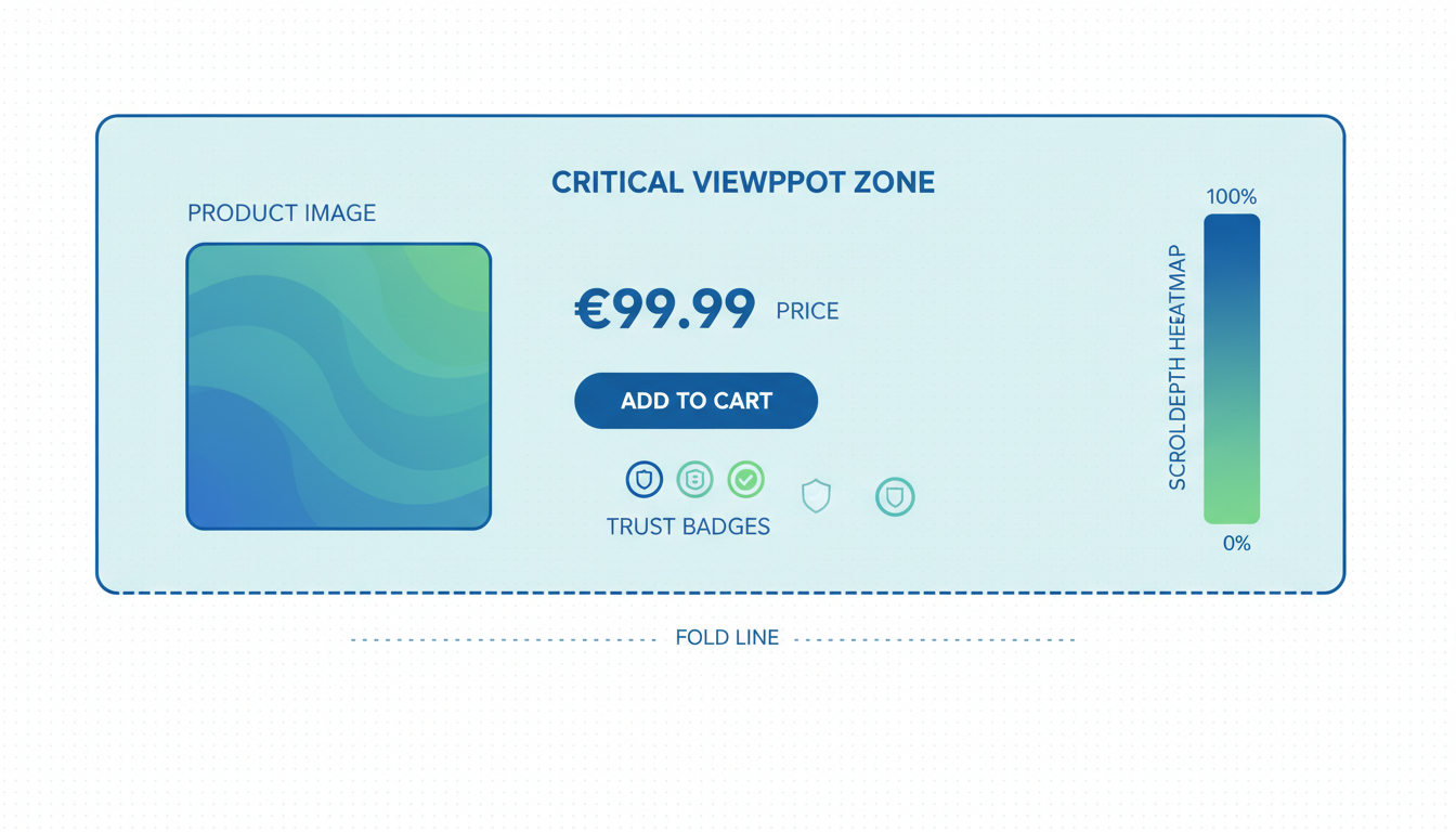
These six elements earn their place on the PDP above fold in 2026. Anything else is either friction or can live below the fold without measurable CR loss. Shipping all six inside a 700-pixel mobile viewport takes discipline, because every theme wants to add more by default.
- Hero image (use-context, not studio). The first 60 to 70% of vertical space on mobile. This is the single highest-weight pixel on the entire store. More on the spec in the next section, but the short version: the image has to answer "is this for me" in under a second, before the title even registers.
- Product title (one line on mobile, one-line on desktop). The title is the brand promise, not the spec sheet. If the title wraps to two lines on a 390px viewport, it pushes the price below the fold and the decision never forms. Cut the SKU, the size, the color, and the material into a smaller subtitle if you need them. The title itself is the one-line promise.
- Price with comparison structure inline. "$49 (was $79)" beats a strikethrough in split tests by 3 to 7% because the parenthetical reads as confidence, not discount desperation. If the product is full-price, the line is just the price. No faux-urgency timer, no "limited time only" badge. Those cost more than they earn above the fold.
- One social proof line (not the full review widget). "Loved by 4,800+ shoppers, 4.7 stars" sitting between title and price, in 12 to 14px type. The full review widget stays lower on the page where it has room to breathe. The one-liner above the fold is a trust anchor, not the proof itself. It exists to let the eye relax before the buy box.
- Variant selector (visible, not dropdown). Color swatches, size buttons, scent chips. If the user has to tap a dropdown to see the options, you lose 5 to 12% of variant exploration, and exploration is how decisions get made on multi-variant products. Single-variant products skip this slot and reclaim the pixels for the buy box.
- Buy box with primary CTA and express checkout. "Get my mug" or "Reserve my pair" as the primary button, with Shop Pay / Apple Pay / Google Pay stacked above it or inline next to it. Shoppers using express checkout convert 1.7x higher than standard. Putting those buttons above the fold captures them before they bounce on a slow checkout.
Six things, 700 pixels, no exceptions. The failure mode is almost always additive: somebody on the team wants the breadcrumb back, somebody else wants the wishlist icon, somebody else wants the collection tag. Each addition feels small. Stack three and you have pushed the add-to-cart button below the fold on mobile, which is the single most expensive mistake a Shopify product page hero shopify layout can make. Audit the page on a 390px viewport before shipping. If the primary CTA is not visible without scrolling, the page is broken regardless of what desktop looks like.
Hero image: aspect ratio, file size, and zoom behavior
The product page hero shopify theme ships with is almost always wrong in 2026, because the default templates optimize for the desktop grid, not the mobile fold. Three specs to get right, in order of weight on conversion:
- Aspect ratio: 4:5 vertical on mobile, 1:1 square on desktop, generated from the same source file. 4:5 uses the vertical space better, which keeps the hero large enough to carry the decision. 1:1 avoids cropping on desktop where the horizontal space is cheap. Shopify's Liquid media tags support responsive image variants out of the box, so you ship one source image and the theme picks the right crop per viewport. Most themes default to 1:1 on mobile, which wastes 20% of vertical space on letterboxing.
- File size: WebP under 180 KB per shot, AVIF under 120 KB if your theme supports it. Most stores ship 600 to 900 KB hero JPEGs because the product photographer exported them that way and nobody compressed them before upload. That single fix knocks 1 to 2 seconds off LCP, which Google's Largest Contentful Paint documentation has been saying for years is the single most important Core Web Vital for PDPs. A fast hero loads before the shopper gets impatient. A slow hero is the bounce.
- Zoom behavior: tap-to-zoom on mobile, hover-to-zoom on desktop, never a full-screen lightbox on the first tap. Lightbox modals that take over the full screen on the first tap are a conversion killer because they break the flow of decision-making and force the user to back out. Inline zoom (the image scales up in place, or a zoomed region follows the tap) keeps context. Shopify's native Dawn theme gets this right. Most custom themes override it and break it, which is usually the reason mobile CR stalls after a theme redesign.
One more spec that does not fit the list: the hero has to be a use-context shot, not a studio shot. Studio shots show the product clearly, which is useful for spec comparison later on the page, but studio shots answer "what is this thing" instead of "is this for me." Use-context shots (product worn, used, plated, installed, lived-with) answer the second question in under a second, which is the one that actually moves the decision. Move the studio shot to slot 2 or 3 in the gallery. Lead with the use-context shot. The 8 to 14% CR lift from this single swap is why it is worth shipping before anything else on the PDP.
Price and promise: the hierarchy that converts
The price area above the fold carries more weight than most stores give it, because it is where "can I afford this" and "is this worth it" collide in about half a second. The hierarchy that converts, from top to bottom in the price block:
- Price first, comparison second, savings third. "$49" big, "(was $79)" next to it smaller, "save 38%" as a subtle tag underneath if at all. The savings line is optional. Most stores make it loud, which reads as discount-desperate and lowers AOV on non-promotional products. On a hero SKU that is not on sale, skip the comparison and savings entirely. Just the price.
- Unit price for consumables, bundle price for kits. "$49 for 60 capsules ($0.82 per capsule)" beats a bare "$49" on consumables by 2 to 4% because it reframes the purchase as value per use instead of total sticker. For kits and bundles, lead with the kit price and show the component comparison below ("$89, save $24 vs buying separately").
- Shipping speed inline, not hidden in tabs. "Arrives Tuesday, April 22 if you order in 4 hrs" sitting under the price beats "Free 3-5 day shipping" by 5 to 10% on impulse-friendly products. The specificity does the work, not the speed itself. Shopify ships this natively via the Shipping Estimator API, or you roll your own with a custom block that reads the shopper's zip from the session.
The "promise" half of the hierarchy is the return policy, which most stores bury in the footer and lose 4 to 8% CR for doing so. "30-day returns, no questions, we pay shipping" sitting as a single line inside the buy box is worth more than any trust badge you could add. The pattern to avoid: returns language that reads like legal copy. "Subject to our Return Policy (see terms)" is not a promise, it is a hedge. If the policy is actually 30 days, say 30 days. If you actually pay shipping, say so. If there are exclusions, handle them on the policy page, not in the buy box. The buy box needs the confident version.
Above the fold shopify pdp hero section work should treat the price and promise as one unit, not two. They answer two different questions (can I afford this, is it safe to try) but the shopper reads them together in a single glance. Splitting them visually (price at the top, return promise three blocks down) breaks the read. Keeping them in the same visual block, with the buy box as the third line of the same unit, is what makes the above-the-fold decision form without a second glance.
Buy box: single variant vs multi-variant architecture
The buy box architecture above the fold has to change based on variant count, because a single-variant product and a six-variant product have different decision paths and the same layout costs you conversion on both. Most Shopify themes ship one buy box template and try to make it work for everything, which is why multi-variant PDPs feel cramped and single-variant PDPs feel padded.
Single-variant buy box architecture: The variant selector slot is unused, so you get those pixels back. Use them for a 2-line product description (not the full description, just the elevator pitch), or for the quantity selector with a bundle prompt, or for an extra trust line. Do not leave them blank. Empty vertical space on a mobile PDP reads as incomplete, not minimalist. The structure that works: hero, title, price with shipping ETA, social proof line, 2-line description, quantity selector, express checkout buttons, primary CTA, return promise. That fits in 700 pixels if the hero is 4:5 ratio and the type is tight.
Multi-variant buy box architecture: The variant selector takes the pixels the description would have taken on single-variant. Swatches or button rows, not a dropdown. If the product has 6+ variants of one type (say 8 colors), consider a "view all colors" link that opens an inline grid rather than listing them all on the fold. For size or fit-critical products, add a "size guide" link inline with the size selector (not in a footer tab). The structure that works: hero, title, price, variant selector (color), variant selector (size), social proof line, express checkout, primary CTA. Description and trust lines move below the fold because the variant selectors need the space.
The handoff between variants and hero is where most multi-variant PDPs leak CR. When the shopper taps a color swatch, the hero image should change to match within 200ms. If it does not (theme caches old variant image, or swap happens but with a visible flicker), the shopper loses trust in the configurator and abandons. Baymard's research on variant selectors, referenced in most Shopify PDP optimization writeups, shows this single interaction failing on roughly 40% of audited stores. Shopify's Online Store 2.0 themes get it right. Older themes usually do not. If you are on a pre-2.0 theme and cannot replicate this behavior cleanly, that is the upgrade trigger.
One more rule across both architectures: the primary CTA button has to be at least 52px tall on mobile. Smaller and it fails the thumb-tap accuracy test on roughly 15% of taps, which shows up as "mis-taps" in heatmaps. 52px is the Apple HIG minimum, and it is the floor, not the target. 56 to 60px is better. Buttons that look too big in the Figma mock usually look right in production.
Trust layer above the fold: the minimum
The full trust layer lives below the fold, but the minimum viable trust signal has to live above the fold or the decision never forms. One line, not ten. Which line to use depends on what the store has earned:
- If review volume is above 500 and rating is above 4.6: "Loved by 4,800+ shoppers, 4.7 stars" with the star icons rendered inline. Count first, rating second, because the count is the trust signal and the rating is the proof.
- If review volume is below 500 but above 50: "4.8 stars from 120+ reviews" with the rating first. Rating leads when count is still building, because the rating is the stronger signal of the two at lower volumes.
- If review volume is below 50: Skip the review line and use a different trust anchor. Press mention ("Featured in Fast Company"), founder quote ("From the team at [brand]"), or a specific product claim ("USDA Organic Certified" or "Made in Vermont, shipped nationwide"). Fake-looking review counts are worse than no reviews above the fold.
- If the brand has a notable guarantee: "30-day trial, keep it or return it free" sitting above the fold as a standalone line is a strong trust anchor on considered purchases. This works particularly well for mattresses, cookware, and anything with a $100+ sticker where the return risk is the main objection.
What does not work above the fold: generic trust badges (McAfee, Norton, SSL Secure icons), money-back-guarantee stickers that look like 1999, or "as seen on" press logos that take more pixels than they earn. These were conversion tools in 2014. In 2026 they read as desperation. Trust signals now have to look like the brand is willing to be checked (real counts, real policies, real press, real ETAs), not like the brand is wearing a trust costume.
The one-line-above-the-fold approach is deliberately minimal because the full trust layer comes right below the fold, typically in the first 400 to 600 pixels after the scroll. The above-the-fold trust line is doing one job only: letting the eye relax enough to commit to the primary CTA. The heavy lifting of trust happens after the click on "Get my mug" fails to go through the first time, or after the shopper hesitates and scrolls looking for more proof. That is what the rest of the page is for. Above the fold, one line is the whole job.
Mobile above-the-fold: different rules
Mobile above-the-fold on a Shopify PDP is a different page than desktop above-the-fold, and treating them as one page with responsive styles is the single most common failure mode in 2026. The mobile viewport is 390x700 at most on a modern phone (iPhone 15, Pixel 8, Galaxy S24). That is about 40% of the vertical space a desktop viewport carries, and the shopper has one thumb, not a mouse. The same six elements have to work, but the layout, sizing, and interaction patterns are not the same.
Three rules that are mobile-only, not shared with desktop:
- The primary CTA has to be above the thumb-line, not below it. The thumb-reachable zone on a 6.1" phone covers the bottom 60% of the screen comfortably, the middle 30% with a stretch, and the top 10% only with a grip shift. Most themes put the primary CTA at the bottom of the buy box, which on mobile lands somewhere around 650px from the top, which is below the thumb-line for a natural one-handed grip. The fix: either shorten the buy box so the CTA lands in the comfortable zone, or make the buy box sticky on scroll so the CTA follows the thumb. Sticky is the more common fix.
- Express checkout buttons stack vertically on mobile, not horizontally. Shop Pay, Apple Pay, Google Pay as three horizontal buttons on desktop works fine because there is room. On mobile, three horizontal buttons shrink each one below the 44px tap-target minimum, and tap accuracy drops. Vertical stack (one button per line) takes more pixels but wins on tap success by 15 to 25%. The trade is worth it. If vertical stack pushes something else below the fold, cut the something else, not the stack.
- No modals, no lightboxes, no interstitials above the fold on mobile. Newsletter signup popups, cookie consent overlays, "welcome 10% off" modals, chat widgets that auto-open. Each one costs 5 to 15% of the first-view CR on mobile because the shopper cannot dismiss them cleanly with one thumb. Cookie consent is legally required in some regions (see GDPR cookie guidance), but it should be a slim banner at the bottom of the screen, not a modal that covers the hero. Everything else is optional and should be delayed until the shopper has scrolled at least once.
The other mobile-only consideration is the keyboard. On any PDP with a zip-code-based shipping estimator or a coupon-code entry above the fold, tapping the input pops the native keyboard and consumes 40% of the screen instantly. If the keyboard covers the CTA, the shopper has to dismiss it to complete the purchase, which is another friction point. Best to keep keyboard-triggering inputs below the fold, or use a separate flow that opens a dedicated modal (where the keyboard has room). The above-the-fold shopify pdp hero section on mobile is a no-keyboard zone. That is a useful heuristic to audit against.
Frequently asked questions
What counts as "above the fold" on a Shopify PDP in 2026?
Do I need a use-context hero image, or can a clean studio shot work?
How many elements should fit above the fold without overcrowding?
Should express checkout buttons (Shop Pay, Apple Pay) go above the fold?
How do I stop the buy box from falling below the fold when I add more elements?
Does above-the-fold optimization matter if the product is a high-consideration, long-page purchase?
Shopify PDP above fold in 2026 is not a design exercise, it is a funnel decision. Six elements, 700 mobile pixels, no room for drift. Stores that treat the above the fold product page as the primary page and everything below as reinforcement tend to cluster at 3.5% to 4.8% PDP conversion rate on healthy DTC catalogs. Stores that treat it as a layout slot and ship the desktop version first stall at 2% and blame the ads, the traffic, or the product. The fix is cheaper than most operators expect: strip the fold back to the six non-negotiables, swap the hero to a use-context shot, tighten the price hierarchy, and make sure the primary CTA is actually reachable without a scroll on mobile. That is usually a two-afternoon job on a standard Online Store 2.0 theme, and the CR lift starts showing up inside the first week of traffic. Best to audit the mobile fold first before anything else, because if the add-to-cart button is not visible at 390x700, nothing else on the page matters yet.
Get a full X-ray of your ad account
Paste your Meta and Google Ads. See exactly where signal is leaking. Free. 60 seconds.